pRODUCT Design
Case Study
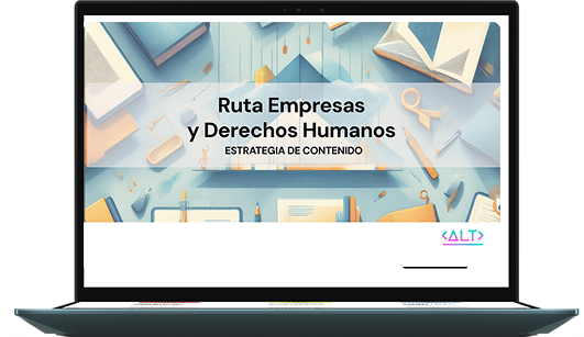
Red empresas
y debida diligencia
The Challenge: Design a first-of-its-kind regional hub for a highly fragmented audience: governments, business leaders, and civil society organizations.
The challenge was twofold: ensuring strategic neutrality in language, structure, and user flows to engage all stakeholders on equal footing, while delivering a simple and unified experience that made courses, events, and community tools easy to find and use.
My Role: Lead Product Designer & UX Strategist. Led the full UX lifecycle, including product strategy, information architecture, user flows, and content design.
Played a key role in unifying fragmented requirements by consolidating community and directory features, setting clear scope boundaries, and aligning three stakeholder groups through structured decision-making sessions.
Extended Team:
- Developer – PM – 3 Stakeholders
 20.39.46")
 19.38.07")
Key product decisions
This was a foundational design and build project. AVINA, ACNUDH, and Conectando Derechos identified a critical gap in Latin America: the absence of a shared, space focused on business and human rights.
Our cooperative was responsible for conceptualizing, structuring, and building the digital ecosystem from scratch, defining both the strategic foundations and the operational logic of the platform.
This project was shaped less by a linear process and more by a series of structural product decisions. High ambiguity, competing stakeholder interests, and the need for long-term regional scalability required prioritizing clarity, neutrality, and governance over feature expansion.
Establishing a Neutral Stakeholder Foundation
Rather than designing for a single audience, we decided to synthesize the needs of three NGOs with differing perspectives. Alignment workshops and research were used to define shared principles and a neutral baseline, allowing the platform to speak to activists, business leaders, and institutional actors without privileging one narrative over another.
Designing Strategic Neutrality Through Language and Interface
We treated voice, tone, and visual hierarchy as core product decisions. Neutral UX writing, accessible labeling, and a sober interface were intentionally chosen to reduce ideological friction, support institutional credibility, and guide diverse users through complex content without cognitive overload.
Architecting a Unified System for Multi-Dimensional Content
Faced with fragmented content types and goals, we chose to unify courses, a resource library, a community directory, and live events within a single information architecture. This decision prioritized findability, long-term content governance, and scalability over isolated feature experiences.
Integrating Design and Build From Day One
Instead of separating design from implementation, we worked closely with the development team during the WordPress build. Early alignment ensured that structural decisions, content logic, and navigation patterns translated accurately into production, enabling a stable launch and a platform prepared for future growth.
Product Features
The platform operates as a multi-sided digital product designed with a simple, open architecture—despite integrating learning, resources, and community into a single system.
Instead of fragmenting access or forcing early registration, the experience allows users to freely explore public resources, content, and community information without logging in. Authentication is required only for active community participation and premium materials, aligning with the platform’s core goal: to act as an accessible entry point to the conversation on business and human rights, inviting exploration before commitment.
Open navigation across resources and community information without login
Premium and community features visible but inactive until authentication
Unified flow integrating education, resources, and community in one experience
Clear filters and content structure to support diverse and opposing user profiles
Login prompts embedded contextually to encourage engagement, not gate access
")
CORE CONTRIBUTIONS
Strategic Neutrality & Stakeholder Alignment
Led the complex synthesis of three major NGOs’ visions. Defined the neutral UX strategy and communication framework that made the platform credible for opposing groups—governments, businesses, and activists. This work was critical to prevent narrative fragmentation and ensure the platform could be adopted as a shared reference point rather than a partisan tool.
SaaS Architecture & User-Centric Design
Designed the scalable information architecture and user flows for a multi-role platform. Architected the profile system and permissions to support diverse user journeys within a single, coherent experience. This approach avoided parallel products or segmented solutions, enabling the platform to scale content, users, and functionality without increasing structural complexity.
End-to-End Product & UX Leadership
Owned the full product lifecycle: Owned the full product lifecycle: from UX research and stakeholder workshops, through interactive prototyping and UI design, to leading UX writing and launch strategy, ensuring a cohesive and impactful go-to-market
")
Latin America lacked a shared digital ground for human rights due diligence—a space where governments, businesses, and activists could coexist. The challenge was not simply to build a platform, but to design a neutral digital territory capable of supporting dialogue, learning, and participation without privileging a single voice.
Our mission: architect that territory through structure, flow, and language.

The Insight That Changed Everything
Early stakeholder discussions focused on features. Through user interviews and emotional mapping, we identified a shared need across all profiles: clarity without bias and trust in the source, regardless of role or position.
This led to a pivotal realization: neutrality is a felt experience.
From that point on, design decisions prioritized emotional safety, cognitive clarity, and institutional trust over expressiveness or persuasion.
How this insight translated into product decisions:
A typography system balanced between institutional clarity and approachability—neither overly formal nor expressive.
A simple information architecture and linear flows, minimizing cognitive load and supporting first-time exploration.
A minimal profile creation process, requesting only essential data to reinforce trust and information security from the first interaction.
A restrained, neutral color palette and light visual system, designed to reduce visual tension and avoid ideological signaling.
Intentional design simplicity, aligned both with budget constraints and with the strategic goal of neutrality.
Impact on the project: These decisions shaped a calm and accessible entry point to a complex and politically sensitive topic. By reducing visual, cognitive, and emotional friction, the platform encourages exploration without requiring early commitment, allowing users to understand the ecosystem before engaging more deeply. This approach helped establish trust across opposing stakeholder groups, supported informed navigation over persuasion, and positioned the platform as a shared, credible reference—rather than an opinionated or exclusionary interface.
Why This Design Matters
Designing a neutral digital space for human rights due diligence required deliberate product judgment. Every choice—access, flow, and language—was a trade-off between openness, trust, and meaningful participation.
Lowered barriers to entry: public resources are accessible without login, encouraging exploration before commitment.
Balanced openness with safety: authentication required only for active participation or sensitive content.
Structured for dialogue and learning: content hierarchy and language choices support equitable engagement, preventing domination by any single voice.
Other Recent Works
")
")